
How to make your own comic book part 7

If you missed part 6 check it out here.
Step 7, Page Layout and Formatting.
When I started laying out the pages of my graphic novel a few years ago, I really had no plan in mind. That created problems for me later when I actually wanted to finish the book to prepare it for printing. Because a graphic novel is about the balance between story and images, your layout must be consistent throughout the story or it will confuse the reader and diminish your storytelling breaking the bond and balance of your creation. This was just one of many problems that I had to overcome to finish my book.

Sequential storytelling is just that, so be consistent. Ultimately, I had to go back and remake many pages of my story because I wasn't consistent with my layout. (see above) I had too many splash pages and not enough multiple panel pages to move the story along. You don’t want to have 4 panel pages through your entire story, and then suddenly throw in a 10 panel page, it wouldn't make sense.
When you start looking through your storyboards, you have to decide how many panels you will need per page in the design of your graphic novel.

These are some of my rough thumbnail storyboards that broke into pages for my book. The first 4 panels is one page and so on.
My solution was a Panel Configuration Key: “P.A.C.K.” for short. (See below). These layout ideas are not to scale. Anytime you need a simple numbered comic book panel reference guide this is a good place to start. I have listed below 1 through 10 panels as a quick reference. There are many other configurations, that you can create.


One panel that can either have a border or a full page bleed, either way this is considered a splash page. Two panels laid out horizontally or vertically.


Three panels laid out horizontally or vertically, your choice. Four panels very straight forward. Use your imagination to get creative.


Five panels with one horizontal on top or bottom. Six panels very straight forward.


Seven panels one horizontal on top or on the bottom. Eight panels very straight forward.


Nine panels, three small ones on top or bottom. Ten panels, don't use this one too much because it's a lot to look at when you have drawings in there.
Before you start any drawing, figure out how many panels you will need per page translated from your story.

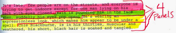
The paragraph (pink highlighter) in the middle that starts with "In the shadows next to him... is only a 1 panel splash page. " It was such an intense scene that I thought it should be a great splash page and that is why it says 1 panel next to it. Basically, I turned that one panel into a whole page. If you're confused, I'll try to clarify below.


I always go back to my story and mark off where one page begins and ends, that way I can work my way through the story to the end. If you have a page limit then use splash pages sparingly if at all.
My general rule of thumb for the subject matter of a splash page is to either do an action panel or a very cool visual with a lot of detail. (see example above and below)
Above story clip equals art below. 4 panels for this page.
Above story clip equals art below. One panel one page.
My general rule of thumb for the subject matter of a splash page is to either do an action panel or a very cool visual with a lot of detail. (see example above and below)

Once I know how much of my dialog I am going to use per page, then I can really begin the layout process. This is where the Panel Configuration Key really helps out. If a panel in my story is basically talking heads, (two people talking) then I know I don’t want a splash page because that is boring. In film, when there is nothing going on except for two people talking, the saying is, “don’t just say it; show it.” You can basically show two people talking without showing two people talking. (See examples below)


Same panel without dialog.


Let your drawings help you decided. (Example if you are drawing a distant scene of a woman walking up a road and you see a lot of the horizon, you probably want a horizontal panel to use for that image). See your P.A.C.K. for options, then choose one. Remember the way that sequential art is read, helps to unleash your story. If you have one of your characters pointing a finger or using a gun, try to point at the next reading panel so the reader will automatically follow the story direction forward and not backwards and it will flow much better. (See example below)

Now that you have your story cut up and your storyboards ready to go, and you know how many panels you want for this page and which configuration you want those panels in, you have to play around and visually see how it works. (See examples below)


This is the final inked 6 panel layout page with dialog and sound effects.
I usually use photocopies of my work and actually cut out my storyboard panels and tape them in place to see how it will look. Sometimes it works, and sometimes it doesn't, but you can always move stuff around more easily this way. The last thing you want to do is cut out an original drawing and stick somewhere else, use photocopies if you can. (See example below)

The P.A.C.K. is just reference when it comes to your panel layout. Through the history of comic books, there have been many changes to the panel, gutter make up. Below are some examples from different eras of comic books. This part is entirely up to you and the style of the book you are going for. My books are pretty straight forward. I basically do about a 1/4 to 1/8 inch gutter on all of my panels. It just makes things easy and quick for me. Will Eisner always pushed the boundaries of what a panel actually was to convey his stories, check out these examples for some very cool, creative options if you want to try something different than boxes on a page.


Frank Bellamy had some very interesting panels in his stories.


Jack Kirby was one of the best at sequential art in the history of comics.
Golden age comic books 1930’s to late 1940’s early 1950’s.http://en.wikipedia.org/wiki/Golden_Age_of_Comic_Books
Used a narrow gutter and a finer panel line to help convey their stories. Check here to read free golden age comic books in the public domain. http://digitalcomicmuseum.com/ or http://comicbookplus.com/

From early to mid-1950’s to 1970’s. These comics were fairly close to the same widths and line thickness as the Golden Age Books.

Bronze Age books http://en.wikipedia.org/wiki/Bronze_Age_of_Comic_Books
From 1970 to 1985. Some of these comics had narrower gutters compared to some of the older books.

From Mid 1980’s to present. Today’s comic book gutter width and line thickness vary greatly. I've seen many comics that use a super narrow gutter that looks almost like slivers of white, and then I've seen it go completely the other way. The bottom line is that you should try to create something that compliments your story. If an open panel does the trick, then go for it. If looks better with a large gutter and thick black lines then do it. The only advice I have is, be consistent with your panels so that the reader is not distracted by weird boxes.

Now that I have done many books, I really don’t worry so much about it now. I'm going to show you how I do it digitally and not hand drawn. It is much easier and efficient to do dialog in Photoshop after everything else is done. Just put it in the back of your mind and draw each panel as if it’s going to be a painting hanging in the Louvre.
One last thing about layout is a two-page spread. I try to get one into every comic I do, just because they look really cool. Here is one below that I did. Basically, it's just two pages put together, the trickiest part is alignment before printing, which I will cover later. The only thing to remember now is to just draw them together so they line up properly, or do one and split it.

My transformation from story, rough storyboards to finished final panel below just to wrap things up.


Final ink and dialog of a 4 panel page.
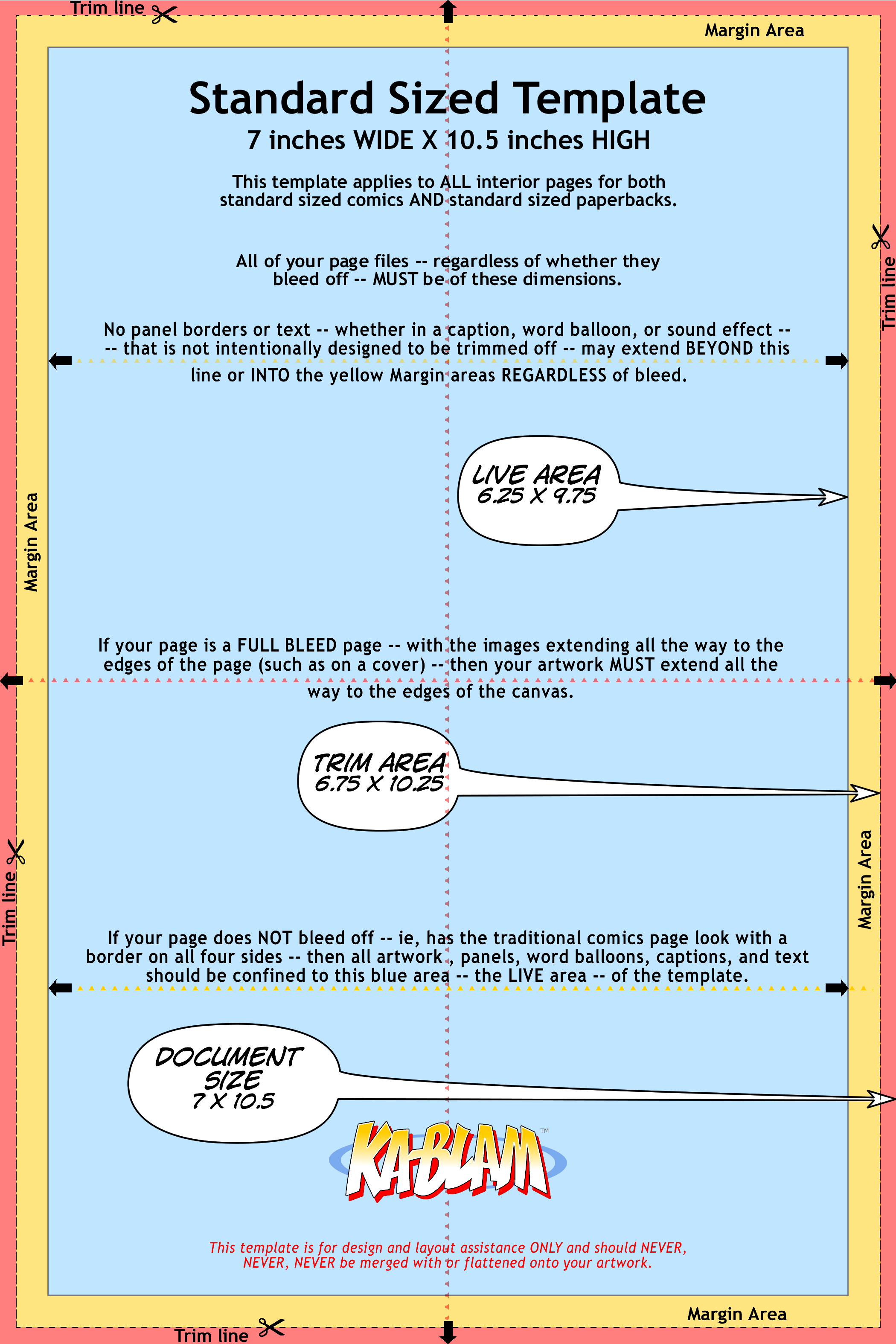
I print most of my comics through P.O.D. (print on demand) printing, and each company has different measurements for their comic books. I will get into the printing aspect of this later, but you have to start somewhere. So here is my solution.
For example:
Createspace (Amazon) suggest comic book printing is 7 x 10 inches.
LULU Printing suggest's comic book interior size at 6.75 x 10.5 inches.
Ka-Blam's template is 7 x 10.5 inches. (see below)

I know this all sounds very confusing, so which one is right for you? Well, all of them, there is no exact standard for P.O. D.. But, I always try to keep my process simple, and the easiest way to do that is to be flexible.
On an 11 x 14 pad of paper I will draw a box 7 x 10 inches which is the outline of the comic page I am going to draw and within that box I will draw my layout panels with a ruler. The 7 x 10 format is the most flexible and easiest to deal with in terms of scanning and printing later on. All the info on paper, pencil and border pens that I use to layout my comic books is here.
Once I have the outlines of the layout drawn, I draw my comic book scenes to complete the page. When I finish one page, I'll leave one blank page in the 11 x 14 pad in between pages and move on to the next page. The reason is, that once we get into inking, you don't want to have ink bleed through to your next page.
Check back soon for Part 8, Inking.
SHARE THIS POST


